Thursday 28 June 2007
Comedy Campaign
While visiting Wimbledon, I also noticed these posters for the days out guide in London, promoting a new offer. They grabbed my attention straight away due to the modification of such famous landmarks. I like the comical edge they have created.
Innocent Drinks
While visiting Wimbledon, I spotted a grass covered van. It caught everyones eye as it looks so unusual. Innocent smoothies have made such an impact, for they has succeeded where virtually every nutritionist has failed: making fruit fun and being healthy easy. The smoothies in small plastic bottles with witty alternative labeling are the drinks to be seen with. Innocent is no passing fad.
Innocent spend a lot of effort in distancing themselves from the corporates. Its witty packaging with ditties such as, ‘separation occurs, but mummy still loves daddy’, Fruit Towers premises, grass covered vans and cow patterned carts provides a studenty alternative image that in a world increasingly disillusioned with Americanisation and corporate power is perhaps as effective a marketing ploy as any other.
Wednesday 20 June 2007
NSPCC - Ventriloquist
This advert was made by Saatchi & Saatchi London in 2004. An advert that I wanted to put on my blog, because I think they have made such a simple idea, very powerful. I find Ventriloquist dolls rather creepy anyway due to their fixed expressions, but in this advert, you really seem to engage with the little girl Sally, and begin to feel her pain..... It really does make you stop and think.
Sunday 17 June 2007
Kylie Exhibition - V&A Museum
Focusing on the evolving image of Kylie Minogue, this exhibition features performance costumes, accessories, album covers and photographs, set against a backdrop of music and video.
I wanted to visit this exhibition, not only as a Kylie fan but also the fact that costume and set design has always given me inspiration in creating original concepts. My initial reaction was the sheer volume of costumes that Kylie has worn since the beginning of her pop career. It also made me think about how long it must have taken designers, creating such complex and intricate designs. There is constant pressure in creating costumes that make a lasting impression and that also give a 'wow' factor on stage.
Lethal Obsession
Part of an award winning advertising campaign that was aimed at doctors rather than patients in an effort to persuade them to prescribe something called Xenical as a ‘fat blocker’. However I think it also refers to unhealthy eating and the damage it can cause to people. I think that this is an effective piece of advertising.... your eye is drawn straight to the imagery which actually looks rather appetising from afar, then you become to analyse the picture and realise its true meaning.
Saturday 16 June 2007
Your Home....Could It Be A Museum?
I was thinking about the idea of Tescos being a museum, and thought that personally I feel that someones home is more of a museum. Its a living space which holds all personal possessions, memories and even the location and decoration shows an outsider the sort of person who is living there. A home can act like a diary, collecting things as you develop as a person.
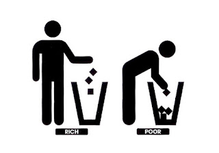
Political Logos
These logos are direct and to the point. They could also be classified as political logos. Here are some examples of how today’s political issues impact on logo design. Both logos are well known, the first logo reminding the public to throw thier rubbish in the bin and the second logo is the infamous Nike tick. By changing well-known logos slightly with a change of action or copy they create a totally different meaning which make people take more notice as it is not the norm. This makes the political logos very clever as they are creating more public interest.
Friday 15 June 2007
Life's too short for the wrong job!
This is a print campaign for the german job site ‘Jobsintown.de’. It’s a big ad printed on the side of different vending machines, making it look like somebody actually is sitting inside, delivering money, taking photos and making coffee. Brilliant concept, and hilarious execution! Some of the best advertising are the ones that don’t work so hard. It is simple, direct and smart. What other types of vending machines could also be as effective?
Friday 8 June 2007
New Shreddies Advert (Old ladys knitting shreddies)
The cereal is one of a number of whole-grain cereals marketed with the whole grain symbol, as part of a marketing campaign emphasising the healthiness of the cereal. I really like this advert as it is bringing the cereal back to basics...showing how the malted squares are inter-woven to create whole grain wheat. The adverts gives across a home-made feel, which I think represents the shreddies essence. The old ladys knitting shreddies could be seen as a little fake and silly but I think they are showing the fact that Shreddies is an established cereal, a classic that everyone loves.
Subscribe to:
Posts (Atom)